Delmira
Client: Adega Fernão Pó
Brand Identity, Naming, Logo Design
South of Lisbon - roughly one hour away from the capital, lies a vast and diverse land with a knack for wine making that does not go unnoticed.
Wine making is where the Freitas & Palhoça family's pillars have stood for roughly 50 years. Following the inheritance of a family house overflowing with fond memories, this building would soon become a rural accommodation, marrying wine making and wine tourism - and vowing for tradition whilst looking ahead.
The challenge - this new accommodation, immediately next to the original wine house, is expected to complement the original business whilst simultaneously work as an independent boutique hotel. But how to keep it's identity unique, facing the wine house and other lodgings - whilst keeping the memories of this house alive?
Working together, we analyzed direct and indirect competitors, and thoroughly developed a concise positioning of the brand, creating a brand book, a bible that would dictate the brand’s visual identity, tone and voice of the brand.
Within the same exercise, came the decision of the name of the new business, and the challenge of tying the existing wine house with the upcoming new accommodation project.
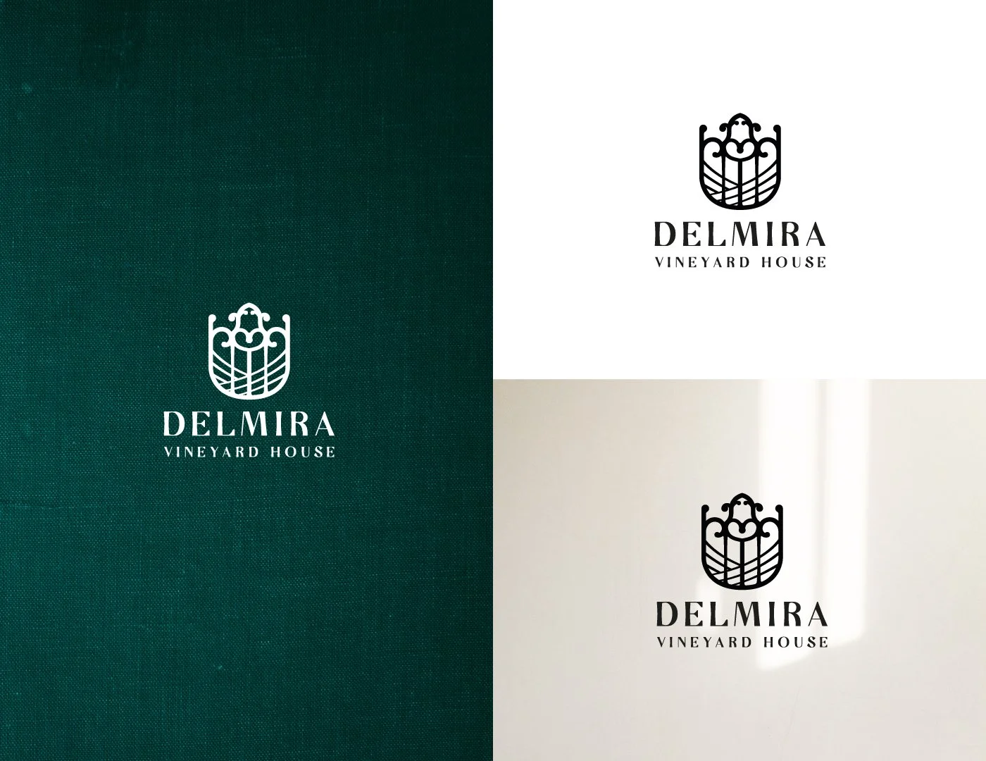
Based on this strategy, the logo and brand identity were developed - selecting typography, colors, shapes, and other elements that would make the special sauce of the brand, and using it to design the email signature, website guidelines, business cards and other stationery.
And thus, Delmira was (re)created. Because what better name for a family house than the one of it’s matriarch?


