Last Kind Words
Client: Jeta Bejtullahu
Brand Identity, Website Design
Last Kind Words is a brand born from a deep connection to the blues, inspired by the haunting song by Geeshie Willie. For Jeta, the founder, she knew deep down that her love for blues and her expertise in strategic work were always destined to blend, creating something truly unique. Jeta's approach to both work and life mirrors the rawness and strength found in the women of blues—a spirit that, at first glance, might seem out of place in the polished EU Bubble. But as one gets to know her, they soon realize just how much they need someone like her.
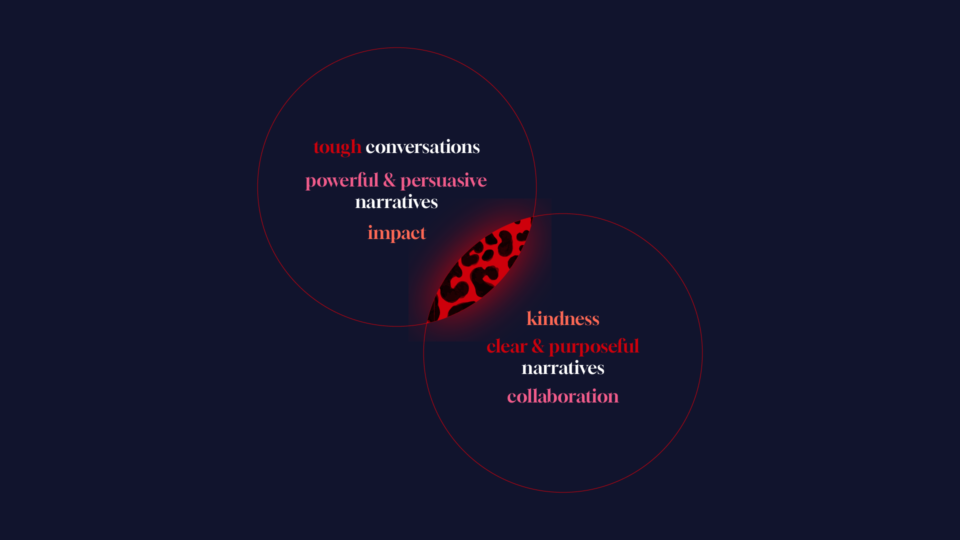
The essence of Jeta's work: Broker strategic clarity and purpose among leaders and teams, frame and refresh narratives with authenticity and persuasive power, and align communications strategies to drive impactful results.
When we collaborated on developing her brand, Jeta took charge of the strategy while I focused on the visual identity. Having the privilege of knowing her well, we spent countless hours discussing fashion, maximalism, art, and our place and mission in the world. Through the development of this work, I discovered that a brand didn't have to resume itself to a set of hard defined rules, and it could still be cohesive—a notion I hadn’t fully explored until working with Jeta, but that I knew I would have to navigate in this particular case. After all, her own personal brand is everything but simple - and it was my duty for her professional side to stay as true as possible.
The logo for Last Kind Words is a powerful geometric representation of a female figure, embodying the essence of the brand.
The figure is not explicitly defined by race, but intentionally designed to represent a woman who exudes strength, kindness, and a sense of mission accomplished.
Our collaboration was a true partnership, with each of us working almost in tandem, ping-ponging between strategy and creative ideas. This back-and-forth required a deep level of trust but also ensured that the final result was incredibly on point. We seamlessly integrated our perspectives, resulting in a brand that perfectly encapsulates Jeta's vision and values.
Last Kind Words is versatile, capable of being whatever it needs to be in any context, yet it remains consistently anchored in rawness and truth. It defies the visual norm seen in the Brussels consultancy world, embodying a dynamic and authentic spirit that’s as powerful as the blues that inspired it. This brand isn’t just a consultancy; it’s a beacon for those seeking something real in a world often dominated by the superficial. In Last Kind Words, Jeta has given the world a brand that stands for authenticity, resilience, and a commitment to truth—her greatest gift.


